Start Learning Data Analysis!

I teach Excel and Power BI to people around the world through my courses & products.
If you are planning to upgrade your skills to the next level, you'll find my courses incredibly useful.
Tag Archives: Dashboards & Visualizations
Ditch the Boring Charts! Try These Creative Budget vs Actual Visuals in your Power BI Reports

In this blog, I will show you two interesting ways to present budget vs actual charts in your Power BI reports. Traditional bar charts can be boring and don’t provide enough insight, but in this video, I’ll introduce two creative budget vs actual charts that not only look great but also reduce the cognitive load needed to understand the data. You can add these charts to your Power BI reports and sales dashboards to effectively show how much of the target has been achieved compared to the budget. Ditch the Boring Charts! Try These Creative Budget vs Actual Visuals […]
Create an Insightful and Stunning Pareto Table in Power BI
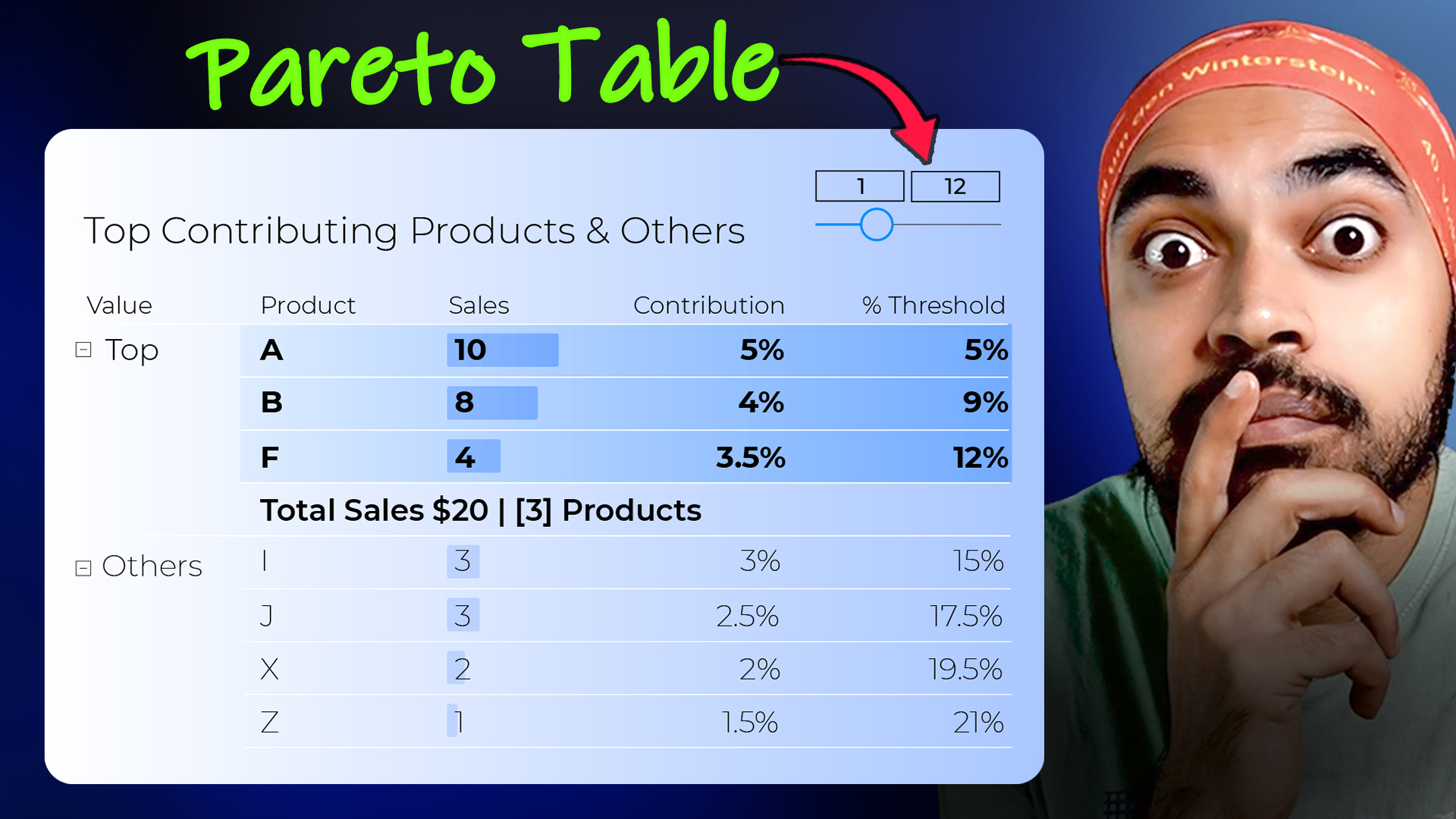
In this blog, I’ll show you how to create a Pareto Table visualization in Power BI that classifies top products in one category and groups the rest. This Pareto analysis, also known as 80/20 analysis, helps you identify key products that drive most of your revenue, making it easier to optimize inventory and marketing strategies. You’ll also learn how to create a slider to dynamically define the percentage for grouping products, adding more flexibility and precision to your analysis. Create an Insightful and Stunning Pareto Table in Power BI
3 Insanely Awesome Slicer Tricks in Power BI
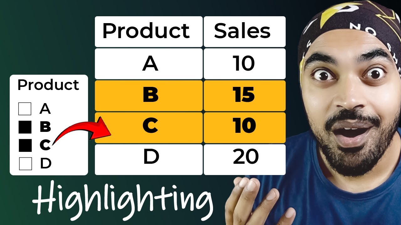
In this blog, we will learn three incredible Power BI slicer tricks that will take your data visualization to the next level. From setting default selections in slicers to highlighting specific elements in visuals, these tricks will surely boost your Power BI skills. 3 Insanely Awesome Slicer Tricks in Power BI
How to Make a Calendar Dashboard in Power BI
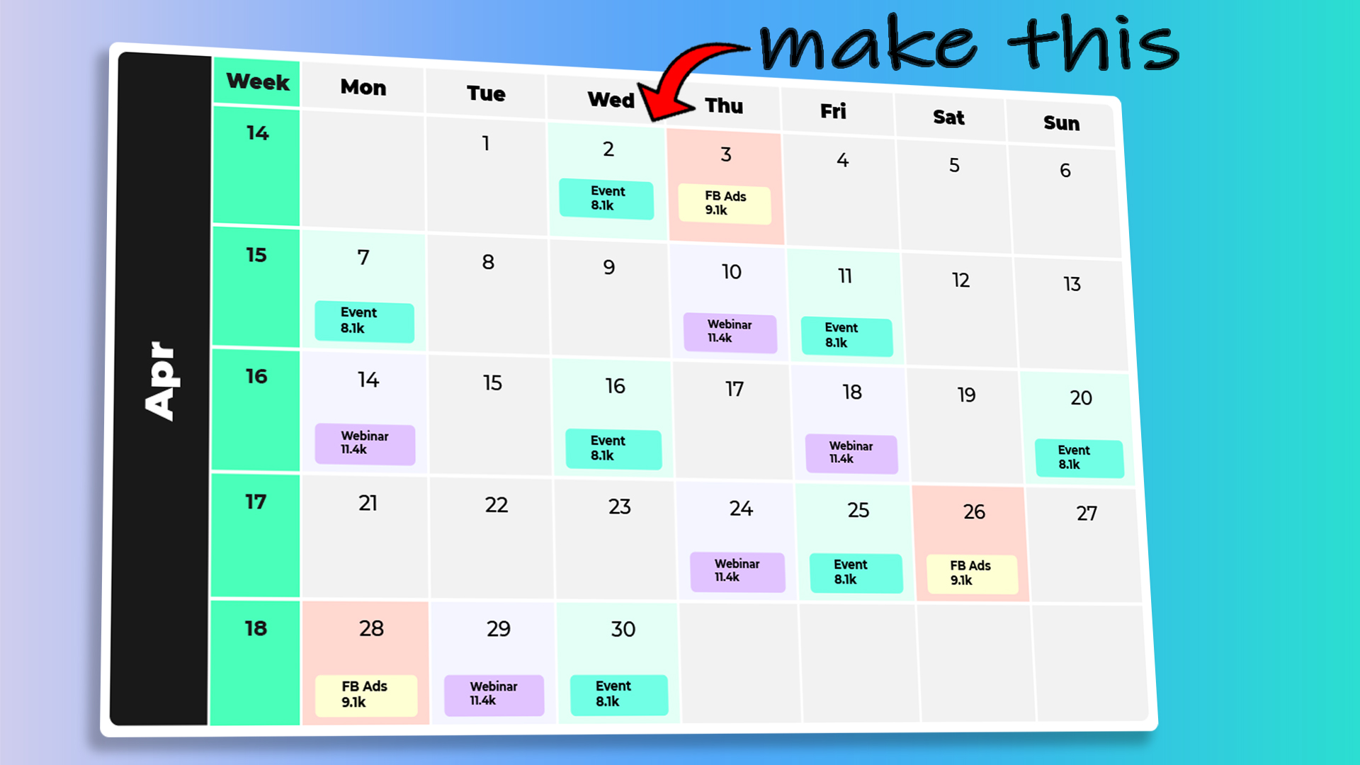
In this blog, you will learn how to present your data on the calendar! Although you have custom visuals available but in case you want to a native visual to act like a calendar,Watch this! How to Make a Calendar Dashboard in Power BI
How to Create a Project Overlapping Timeline Dashboard in Power BI

In this blog tutorial, I will guide you through the process of creating a visually engaging and interactive project overlapping timeline dashboard using Power BI. You will learn how to prepare your data, apply Dax and visualization tricks, and set up slicers to highlight overlapping months for each project between the start and end dates. By the end of the blog, you will have the skills to create your own custom interactive dashboards in Power BI. How to Create a Project Overlapping Timeline Dashboard in Power BI